A new blog for 2024
It’s been a long time since I’ve published a blog post, two whole years. Part of the reason is that it took too much effort to create posts for my previous blog. I needed better DX. A few nights ago, feeling inspired after reading articles by Pedro Duarte, Rauno Freiberg, and Lee Robinson, I decided it was time to start over.
Aims
So here’s the score—I want a blog with great DX that makes it as easy as possible to create posts. I also want to go minimal, so I can get away with a single design on mobile and desktop. No faffing around; I want this blog built and published in 5 days! And lastly, I’m looking to try some new libraries and technologies. Right, let’s dive in.
Design
At work I spend most of my time writing and programming, so dipping my toes into design was a nice change. Here’s a couple of details.
Animated header
For the header, I was aiming for an animated background that combined an
aurora, light beams, and a rainbow. I’m quite pleased with the result, and
it's actually pure CSS—try changing hue-rotate below to emulate the animation.
.aurora {
  filter: hue-rotate(0deg) saturate(7.0) blur(30px);
}Saturated text
All text that overlays the aurora is saturated with its underlying colours—a
tiny touch that really unifies the design. You can do this by simply applying a
luminosity blend mode
to the text.
Noise
I’m applying a tiny amount of film grain to the body. To me, this makes the
page feel like one consistent piece; as you scroll down, the noise sticks to the
content, somewhat similar to seeing texture on paper.
.noise {
  opacity: 0.025;
}I wouldn’t recommend noise for most websites, and it’s very easy to overdo it, but I enjoy the subtle filmic effect on my blog.
Catalyst
I’m using Catalyst, a new UI kit by the Tailwind team. It’s clear that a tonne of thought has gone into making these components accessible, and pixel perfect, on both light and dark modes.
Catalyst provides you with a set of files to download into your project, and you can export your components from these. Heroicons has also been updated with new icons that fit neatly into Catalyst.
import { Button } from "../components/Button";
import { PaperAirplaneIcon } from "@heroicons/react/16/solid";

function Component() {
  return (
    <Button type="submit" color="rose">
      <PaperAirplaneIcon />
      Send message
    </Button>
  );
}
If you’d like to customise your components further, you can edit the downloaded files directly. Each file contains Headless UI components with lists of carefully annotated classes dispersed throughout.
<HeadlessListBoxButton
  className={clsx(
    // Basic layout
    "group relative block w-full",

    // Focus ring
    "after:pointer-events-none after:absolute ...",

    // Disabled state
    "data-[disabled]:opacity-50 before:data-[d..."
  )}
  // ...
/>
Catalyst is still in alpha, so be warned, breaking changes will most likely be ahead!
TWC
While we’re talking about Tailwind, I’ve used a new library called
TWC to save time building reusable components.
It takes boilerplate code you've written countless times (forwarding refs,
adding clsx, etc.), and makes it a one-liner.
const Card = twc.div`rounded-lg border bg-slate-100 text-white shadow-sm`;

<Card ref={ref} className={["my-6", hidden && "hidden"]} {...props} />;
Code
Next.js
I’ve used Next.js to build my new blog, and virtually every component is a server component. It feels pretty snappy, I like it.
Layout files
Did you notice that the header animation continues running when you change pages? That’s because it’s placed in a Next.js layout file, meaning it doesn’t get refreshed on route changes.
// layout.tsx
export default function Layout({ children }) {
  return (
    <>
      <HeaderAnimation />
      <main>{children}</main>
    </>
  );
}
OG image generation
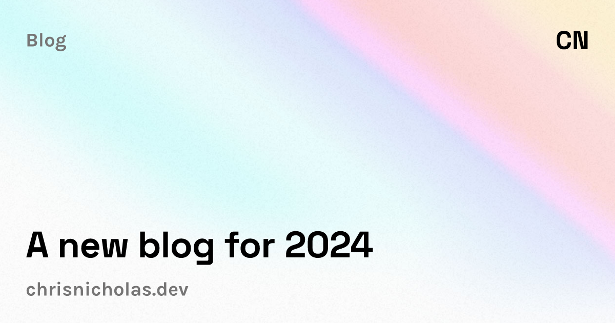
A major pain point on my previous blog was manually creating each social media image. Nowadays, you can generate OpenGraph images dynamically in Next.js, and it’s very little effort to get started.

// /blog/[slug]/opengraph-image.tsx
export const runtime = "edge";
export const alt = "...";
export const size = { width: 1200, height: 630 };

export default async function Image({ params }) {
  return new ImageResponse(
    (
      <div style={{ display: "flex", color: "#000" }}>
        <div>A new blog for 2024</div>
        ...
      </div>
    ),
    { ...size }
  );
}
Contentlayer
My blog uses .mdx files with custom React components interspersed throughout.
I’d heard a lot of good things about Contentlayer,
so I gave it a try—it’s been a breeze to use, and has really sped up my
development time. It’s so easy to make changes to your schema, and the type-safe
setup is excellent.
How it works
You can generate a Post schema, for example with a title and date, and
then ask it to load files from the /posts folder.
export const Post = defineDocumentType(() => ({
  name: "Post",
  filePathPattern: `/posts/**/*.mdx`,
  contentType: "mdx",
  fields: {
    title: { type: "string", required: true },
    date: { type: "date", required: true },
  },
}));
Next, create your .mdx file in /posts.
---
title: A new blog for 2024
date: 2024-01-02
---

It’s been a _long_ time since I’ve publis…
Then simply import your posts, with full type-safety, and render your mdx
content.
import { allPosts, type Post } from "contentlayer/generated";
import { useMDXComponent } from "next-contentlayer/hooks";

// { title: "A new blog for 2024", ... }
const post: Post = allPosts[0];

// <p>It’s been a <em>long time</em> since I’ve publis…
export default function Page() {
  const MDXContent = useMDXComponent(post.body.code);
  return <MDXContent />;
}
Archived posts
I’ve archived all the posts from my previous blog, ctnicholas.dev, as it’d take too long to transfer them to the new site, though they’re all still available to read.
Closing thoughts
My blog’s a work in progress, and there's so much more I’d like to add, for example:
- Code snippets with more features, languages, and interactivity.
- Real-time comments and multiplayer presence.
- Dynamic content that streams in with partial prerendering.
But it’s all too easy to get stuck in the “just one more feature…” loop, when the most important thing is to get shipping! So here it is—thanks for reading.

